Dashboard
The Dashboard is the first thing you see when you log in. Depending on your plan, it ranges from a single net-income snapshot up to a full picture of partners, contracts, and payment trends.
Selecting the dashboard period Free
How much history the Dashboard shows, and what it covers, depends on your plan:
- Free — a Short / Medium / Long selector, mapping to 1 / 3 / 6 months (Net income only)
- Starter Starter+ — the same Short / Medium / Long selector (1 / 3 / 6 months), now applied to both charts
- Pro Pro — Short / Medium / Long, but Net Income maps to 1 / 3 / 6 months while Contracts Growth maps to the wider 6 / 12 / 24 months
Overview cards
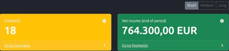
- Net income (end of period) — your net cash position at the end of the selected period: your balance at the start of the period, plus payments received, minus payments made, including any payments already scheduled for later in the period
- Partners and Contracts Starter+ — the total number of partners and vendors, and the number of currently active contracts. On Free, only the Net income card is shown.
Charts
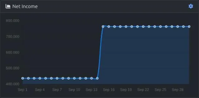
Net Income — an area chart showing your running balance for each day of the selected period, starting from your balance at the beginning of the period and adding or subtracting each day's payments. It covers the whole period, including days still to come — so if a payment is already scheduled for later on, it's reflected in the chart now, not just once the day arrives.
Contracts Growth Starter+ — a bar chart showing the number of active contracts at the end of each month within the selected period, so you can see whether your contract base is growing, shrinking, or holding steady.
Customizing a card or chart
Every overview card and chart has a small gear icon in its top-right corner. Click it to open that widget's own settings:
- Resource — which data the widget shows: Partners, Contracts, or Payments. Only the resources your plan already unlocks elsewhere on the Dashboard are offered.
- Show: Last value / Aggregated — for a card, Last value is the current/most recent number (e.g. how many contracts are active right now); Aggregated instead sums up the net change over the selected period (e.g. how many contracts were newly added, or the total net payments received). For a chart, Last value plots each period's own change; Aggregated turns the chart into a running total instead.
- Starting point (only shown for an aggregated chart) — Continue from before keeps building on your history, exactly like the default charts; Start at zero resets the running total to zero at the beginning of the selected period, so you see only what changed within that period.
- Time period — overrides the Dashboard's own Short/Medium/Long switch for this one widget. When set, the widget's heading shows the exact date range it's using instead of following the shared switch.
These settings are saved to your account, not just your browser — they look the same the next time you sign in, on any device.
Latest contracts Starter+
The Dashboard includes a table showing your most recently updated contracts. Each row shows the contract name, its type, the linked partner, and its tags and description. Choose how many rows to show, and click View on any row to open that contract.
Latest payments Starter+
A second table below the contracts shows your most recently recorded payments, with the payment name, whether it's a recurring or one-time payment, and the linked contract. Choose how many rows to show, and click View to open the payment.
The "last known" indicator
The Latest contracts and Latest payments tables, and every overview card and chart, can keep showing the most recently loaded data when your connection is slow or temporarily unavailable, marked with a small database icon you can hover for the showing cached data — server not reachable tooltip. This tells you the numbers are accurate as of that time; it updates automatically once the server is reachable again.